A website that's up and running isn't the same as one that's working for you. Plenty of small business sites load fine, look reasonable at a glance, and still quietly cost their owner customers every week. Here are five of the most common reasons, and what each one usually takes to fix.
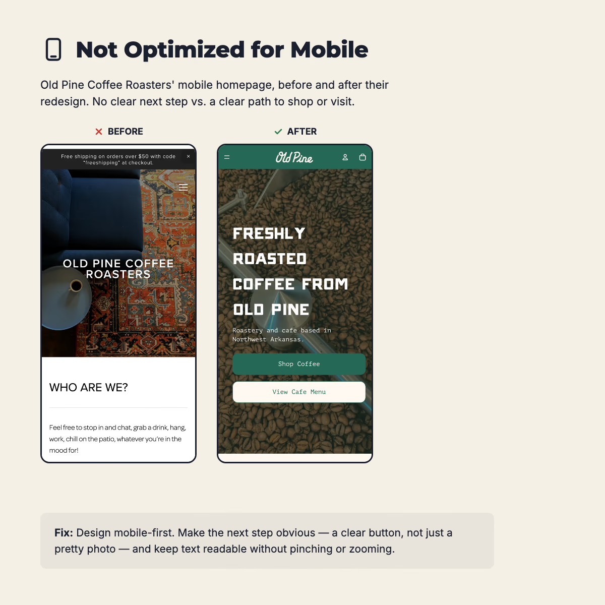
1. It's not optimized for mobile
The majority of visitors are hitting your site from their phone, and that number only keeps climbing. If your site isn't built for mobile, you're not just annoying people, you're losing leads. A cramped layout, tiny tap targets, or anything that requires pinching and zooming sends visitors straight back to search results, and your bounce rate climbs right along with them.
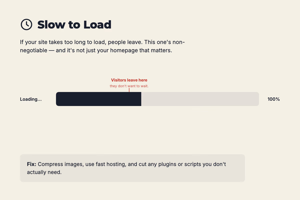
2. It's slow to load
If your site takes too long to load, people leave. This one's non-negotiable. Don't just check your homepage either, slow load times tend to show up as visitors click deeper into the site, and that's often where you actually need them to stick around.
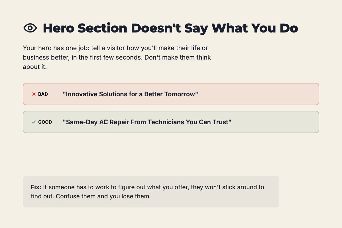
3. Your hero section doesn't say what you do
Tell people what you do. Don't make them think about it. Your hero section has one job: let a visitor know, in the first few seconds, how your business is going to make their life or their business better, without scrolling or guessing. If someone has to work to figure out what you offer, they won't stick around long enough to find out. Confuse them and you lose them.
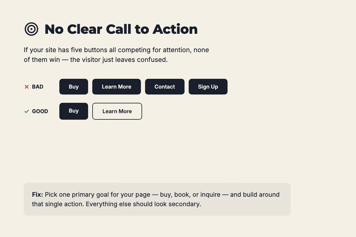
4. There's no clear call to action (or too many)
If your site has five buttons all competing for attention, none of them win, the visitor just leaves confused. Pick one primary goal for your website, buy now, request a quote, book a call, whatever it actually is, and build the page around that single action. A secondary button is fine, but it should look secondary. Everything else should be styled as a plain link, not a button.
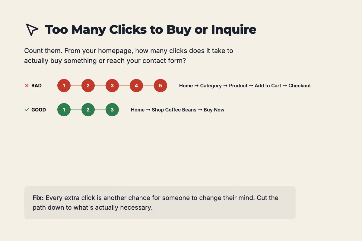
5. It takes too many clicks to buy or inquire
Count them. From your homepage, how many clicks and how much scrolling does it take to actually buy something or reach your contact form? If you have to stop and think about the answer, that number's too high. Every extra click is another chance for someone to change their mind.
What to do about it
If your website is suffering from one (or more) of these issues, it is an opportunity for you to improve your online presence and provide a better experience to your visitors. I enjoy this part of the work: auditing sites, finding where visitors are dropping off, and improving the UX and UI so the site actually works for the business behind it. Sometimes that's a handful of focused fixes. Other times it's a full redesign.